可直接使用的提示词
原文
Build a single-page landing site for "Drift" -- a calm, ADHD-friendly planner app. Use React + Vite + TypeScript + Tailwind CSS + lucide-react for icons. No other UI libraries.

### Fonts

Import via Google Fonts in `index.css`:
- **Inter** (weights 400, 500, 600) -- used as base body font
- **Instrument Serif** (italic only) -- used for the italic word "the stress" in the hero heading

```css
@import url('https://fonts.googleapis.com/css2?family=Instrument+Serif:ital@1&family=Inter:wght@400;500;600&display=swap');
```

Body: `font-family: 'Inter', sans-serif;` with antialiased rendering. `overflow-x: clip` on body.

### Color Palette

- Hero overlay: `bg-black/20`
- About section background: `#F6E4CF`
- Dark text / icons in About: `#321C04`
- Light cream (button backgrounds in About): `#FFF9F2`
- Muted accent (divider, secondary button bg): `#D9C4AA`
- Secondary button hover: `#CEBA9E`
- Dark button hover: `#1F1003`

### Tailwind Config

Add a custom keyframe `fade-in-down` (0%: opacity 0, translateY -8px; 100%: opacity 1, translateY 0) with 0.2s ease-out animation.

---

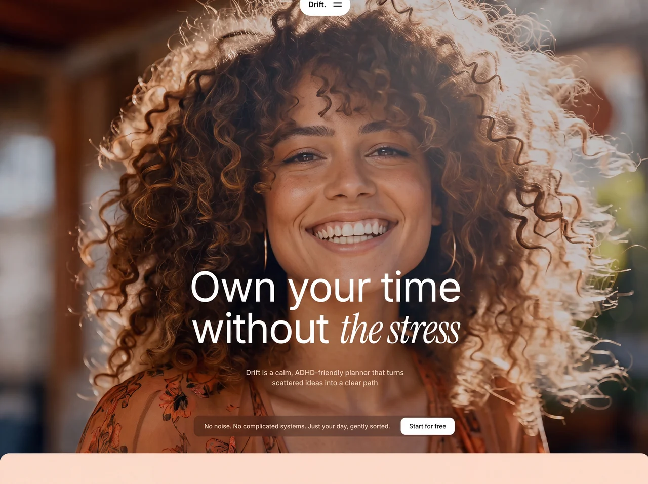
### SECTION 1: HERO (full viewport height)

- Full-screen section (`h-screen`, `overflow-hidden`, `mb-[-25px]` negative bottom margin so the next section overlaps it slightly)
- **Background video** (autoPlay, muted, loop, playsInline, object-cover, absolute inset-0):
  ```
  https://d8j0ntlcm91z4.cloudfront.net/user_38xzZboKViGWJOttwIXH07lWA1P/hf_20260711_090308_1dd0cea7-f9ba-4db4-8147-c7d746061c9e.mp4
  ```
- **Semi-transparent overlay**: `absolute inset-0 bg-black/20`

#### Navbar (centered floating pill)
- Positioned `absolute top-6 left-1/2 -translate-x-1/2 z-50`
- White rounded-full pill with shadow-lg containing:
  - Brand text "Drift." (text-lg, font-bold, tracking-tight, text-black)
  - Animated hamburger icon (two lines that animate to an X on click using rotate-45/-rotate-45 with cubic-bezier(0.77,0,0.175,1) easing, 300ms)
- Dropdown (below the pill): white rounded-2xl container with links "Features", "Drift AI", "FAQ". Animated with opacity/scale/translate transitions. Hidden by default, pointer-events-none when closed.

#### Hero Content (bottom-aligned)
- Flex column, `justify-end`, padding bottom 12 (md:16)
- **Heading** (centered):
  - Line 1: "Own your time" -- text-5xl / sm:text-7xl / md:text-8xl / lg:text-[96px], font-normal, text-white, leading-[1.1], tracking-tight
  - Line 2: "without *the stress*" -- same sizing. The words "the stress" are rendered in Instrument Serif italic via inline style `fontFamily: "'Instrument Serif', serif", fontStyle: 'italic'` inside an `<em>` tag with className `not-italic`
- **Subtitle**: "Drift is a calm, ADHD-friendly planner that turns scattered ideas into a clear path" -- text-white/80, text-sm md:text-base, font-medium, max-w-[420px], centered
- **CTA Bar** (centered below heading with gap):
  - Container: `bg-black/25 backdrop-blur-md rounded-xl`, flex row, items-center, pl-6 pr-1 py-1
  - Desktop text: "No noise. No complicated systems. Just your day, gently sorted." (text-white, text-sm, font-medium, hidden on mobile)
  - Mobile text (sm:hidden): "No noise. Just your day, gently sorted."
  - Button: "Start for free" -- bg-white, text-black, text-sm, font-medium, px-5, py-2.5, rounded-xl, hover:bg-white/90

---

### SECTION 2: ABOUT SECTION

- Background: `bg-[#F6E4CF]`
- **Rounded top corners**: `rounded-t-[25px]` with `relative z-10` (overlaps hero by 25px)
- Padding: py-20 md:py-32, px-6

#### Top Area (centered, max-w-3xl)
- Paragraph: "We craft tools that move with your rhythm, not over it. Designed for ease, presence, and flow." -- text-[#321C04], text-base md:text-lg, text-center, leading-relaxed, max-w-lg
- Two buttons (flex-wrap, centered, gap-4):
  1. **"Say hello"** -- dark pill button (`bg-[#321C04]`, `text-[#FFF9F2]`, rounded-full). Has a white circle on the left containing a Mail icon (lucide-react, size 16). Text is uppercase, tracking-wide, font-medium.
  2. **"Stay informed"** -- muted pill button (`bg-[#D9C4AA]`, `text-[#321C04]`, rounded-full). Has a white circle on the left containing a Plus icon. Same text styling.

#### Decorative Divider
- Full-width flex row with: small circle (w-2 h-2 rounded-full bg-[#D9C4AA]) + 2px gap + horizontal line (flex-1 h-[2px] bg-[#D9C4AA]) + 2px gap + small circle

#### Bottom Area (max-w-6xl, flex-col md:flex-row)
- Left: Custom SVG logo (40x40, viewBox 0 0 256 256, abstract geometric shape with rounded quadrants, fill #321C04) + label "Calm / Amplified" (text-xs, uppercase, tracking-widest, font-semibold, line break between words)
- Right: Large paragraph: "We make AI tools and assistants. But, most importantly, we help you remember what gentle productivity looks like when software moves with you, not over you. We create systems that carry the cognitive weight, so you can attend to what truly counts." -- text-2xl / sm:text-3xl / md:text-4xl / lg:text-[42px], leading-[1.3], font-normal, text-[#321C04]

---

### SECTION 3: FEATURES SECTION (scroll-driven cards)

- **Fixed background image** (behind content, -z-10):
  ```
  https://images.higgs.ai/?default=1&output=webp&url=https%3A%2F%2Fd8j0ntlcm91z4.cloudfront.net%2Fuser_38xzZboKViGWJOttwIXH07lWA1P%2Fhf_20260709_082449_46df5cc4-ad98-4541-9236-a2659c1478a4.png&w=1920&q=85
  ```
- Padding: px-5 md:px-10 lg:px-16, py-20 md:py-40 lg:py-48

#### Layout: CSS Grid on lg+ (400px / xl:460px left column, 1fr right column, gap-24 / xl:gap-48)

#### Left Column (sticky on desktop)
- `lg:sticky lg:top-0 lg:h-screen lg:flex lg:flex-col lg:justify-between lg:py-32`
- Heading: "Software that flows with your mind, not over it" -- text-white, text-2xl / sm:text-3xl / lg:text-[46px], leading-[1.2], font-normal
- Feature nav buttons (hidden below lg): list of feature titles as buttons. Active state: `bg-black/20 text-white`. Inactive: `bg-black/20 text-white/40`. Clicking scrolls to card (smooth, block: center).
- Bottom CTA (hidden below lg): "No noise. No complicated systems. Just your day, gently sorted." + "Start for free" button (same style as hero)

#### Right Column (scrolling cards)
- 3 feature cards with IntersectionObserver:
  - **Active detection** (threshold 0.6): highlights corresponding nav button
  - **Reveal animation** (threshold 0.15): cards slide in from right (translate-x-16 to translate-x-0, opacity 0 to 1, duration-700, ease-out). Once revealed, stays visible.

Each card (`bg-black/20 backdrop-blur-sm rounded-3xl p-6 md:p-10`):
- Same SVG logo (40x40, fill rgba(255,255,255,0.8))
- Title (text-white, text-xl md:text-2xl, font-medium)
- Video (aspect-video, rounded-2xl, overflow-hidden, bg-black/30, autoPlay/muted/loop/playsInline)
- Description (text-white/60, font-medium, text-sm md:text-base, leading-relaxed)

**Feature data:**

1. Title: "Built for ease, not urgency"
   Description: "Drift strips away the noise that makes organizing feel draining. Every surface is made to be soft, quiet, and intuitive so you can move forward, not get stuck decoding."
   Video: `https://d8j0ntlcm91z4.cloudfront.net/user_38xzZboKViGWJOttwIXH07lWA1P/hf_20260702_102608_5fa1187d-9ac6-44fb-82ab-54376200abc0.mp4`

2. Title: "The gentlest way to start"
   Description: "Beginning your day should feel natural, not daunting. Drift eases you into motion with subtle cues and a quiet view of what deserves your energy right now."
   Video: `https://d8j0ntlcm91z4.cloudfront.net/user_38xzZboKViGWJOttwIXH07lWA1P/hf_20260625_174131_395bc785-bb21-4e65-abf6-27c56f0764b6.mp4`

3. Title: "Deep, undivided focus"
   Description: "No interruptions, no clutter. Drift holds you in the present task with a stripped-back layout that softens all else until you are truly ready to shift."
   Video: `https://d8j0ntlcm91z4.cloudfront.net/user_38xzZboKViGWJOttwIXH07lWA1P/hf_20260525_052706_d2e390fd-1846-4fe7-a4d8-8d2f1c875358.mp4`

---

### SVG Logo (used in About + Feature cards)

```svg
<svg xmlns="http://www.w3.org/2000/svg" width="40" height="40" viewBox="0 0 256 256" fill="none">
  <path d="M 256 256 L 178 256 C 150.386 256 128 233.614 128 206 L 128 256 L 0 256 L 0 192 C 0 156.654 28.654 128 64 128 C 99.346 128 128 156.654 128 192 L 128 128 L 256 128 Z M 78 0 C 105.614 0 128 22.386 128 50 L 128 0 L 256 0 L 256 64 C 256 99.346 227.346 128 192 128 C 156.654 128 128 99.346 128 64 L 128 128 L 0 128 L 0 0 Z" fill="#321C04" />
</svg>
```

---

### File Structure

```
src/
  App.tsx          -- Hero section + renders AboutSection + FeaturesSection
  main.tsx         -- ReactDOM render
  index.css        -- Font imports + Tailwind directives + body styles
  components/
    Navbar.tsx     -- Floating pill navbar with animated hamburger
    AboutSection.tsx -- Cream-colored about section
    FeaturesSection.tsx -- Dark features with sticky left + scrolling cards
```
案例说明
面向现代品牌的完整落地页效果,以悬停反馈、沉浸式视频组织视觉层次;适合用于网页原型、品牌展示与交互动效参考。
适用信息
适配模型:React + Tailwind CSS + Motion
难度:进阶
标签:网页特效、完整落地页、悬停反馈、沉浸式视频、App
动态效果预览
来源:AI妙词(已获授权转载),原条目 ID 220。